
Thursday, 15 March 2012


Thursday, 8 March 2012
Wednesday, 7 March 2012
Tuesday, 6 March 2012
Monday, 5 March 2012
Evaluation Question 4
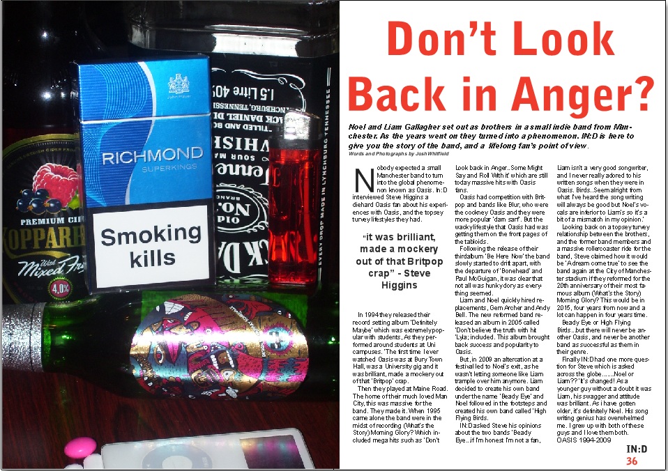
These are 2 songs which fit perfectly into the category of my media product. "The Stone Roses - I Wanna Be Adored", "Oasis - Slide Away" and "The Wombats - Techno Fan" are prime examples of Indie songs, and they are both involved in my media creation, with Oasis being the whole inspiration towards creating the Double Page Spread article.
This is Adam, he is a prime example of somebody from my target audience. He dresses in an Indie way and listens to stereotypical Indie music. His favourite band are The Wombats who are mentioned in my magazine.

Sunday, 4 March 2012
Saturday, 3 March 2012
Thursday, 1 March 2012
Tuesday, 7 February 2012


Monday, 6 February 2012
Developed Print Screens


Friday, 27 January 2012
Print Screen of front cover, developed

 With this developed print screen, there has been a few changes to try and move it up a mark. Firstly, I decided to change the large central image, which dominates the whole of the front cover. The old image, was too dark and slightly out of focus, and in order to have a successful front cover, this needed to be changed. I changed it to quite a similar image with the same mise-en-scene as the first image, and the same person who is in the image. The main difference is the focus and crispness of the image which was vital for the front cover.
 Friday, 13 January 2012
Print Screen from Developed Double Page Spread

For the double page spread I used Quark once again. Quark was good for the structure and layout, because it gave me the guidlines to do the separate columns, the picture and the masthead with the standfirst paragraph. This was very simple to use, with the text box being the most important tool for me as the whole article is predominantly made up of text. As i used Quark for the contents page, by the time it came to the double page spread, it was pretty easy to construct, with organising the drop capital being the most complicated thing to do.
Print Screen from Developed Contents Page

For the contents page I used quark, which was effective in giving me the structure and layout for the contents page. The most commonly used tools for me, was the create a box, text box and picture box tools. This basically made up my whole contents page, with changing the colours as the only thing that I needed to modify. Quark was complicated at the start to use, but the further you got with it, the easier it became to understand and use.
Friday, 6 January 2012
Print Screen for Developed Front Cover

With this front cover I used photoshop. Photoshop was helpful to use because it allowed me to create whatever I wanted and have my magazine however I wanted it. I used the text tool mostly, because there are a lot of coverlines on the front cover, so this was important for me to use. Also I used the create a box tool which was the surrounding bar at the bottom for the text 'FREE!! Soundtrack to Kevin Sampson's Away Days!! & Competitions'. Photoshop was difficult to use at the beginning in the preliminary task, but once you get used to it, it was quite simple to use.
Subscribe to:
Posts (Atom)