With the front cover, the main tool i used was the text tool, as the whole front cover is dominated by text, due to the coverlines and the main cover line which is used to attract the audience. I also had to use the create a shape tool, to create the red oblong banner at the bottom of the page, and also the oval black shape in the top right hand of the page, plus it was also used to create the red box surrounding the masthead. The picture tool was also used for the picture on the front cover, which meant the resizing tool was used to make sure it was perfect.

With the contents page, the main tools used where: The create a text box tool, because three quarters of the page is made up of text, also the create a picture box tool, which is vital on a contents page, plus the shape tool, because i needed to add a banner at the top of the page which surrounded the masthead and the words "CONTENTS PAGE" plus the one big black box at the bottom of the page with the red writing, which was full of extra information about the magazine.
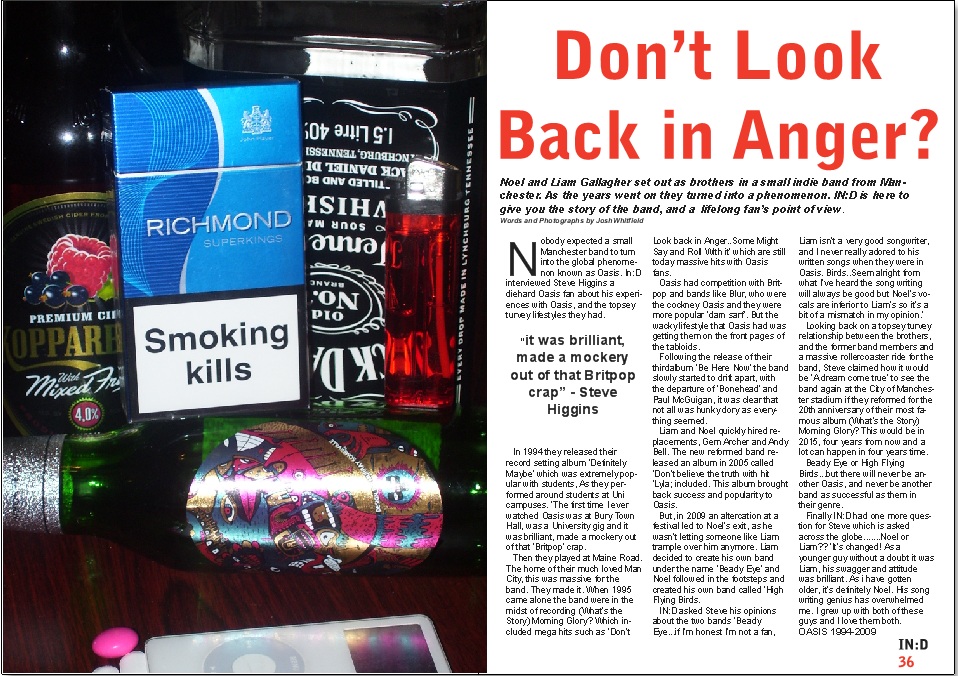
With the Double Page Spread, I had to use many different tools(unlike the contents page). I had to use the drop capital tool, for the big "N" at the start of the article. I also had to use the drop quote tool, for the large quote used to catch the eye of the reader. I also had to use the line spacing tool, and the line indentation tool, so it looked realistic, and looked like a professional media product. I had to use the text tool, to create the title for the article, and to write the whole article. Finally i had to use the picture tool to bring in my picture for the article, which symbolises Oasis.